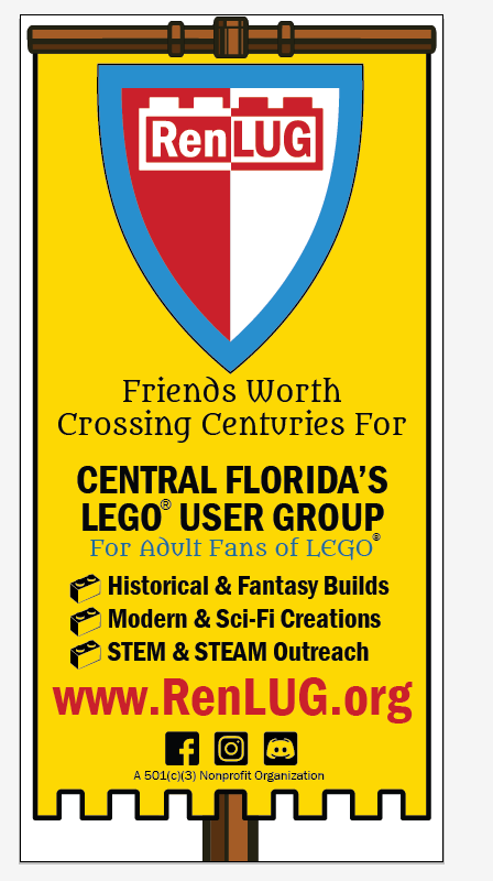
Many have commented on our updated branding for 2025 and beyond. Our colors come from LEGO’s 1964–1972 logo, but they also echo the Renaissance language of heraldry. Yellow for imagination’s light, red for courage in creation, blue for fellowship, white for openness, and black for constancy. Together, they form our banner: one of builders, dreamers, and friends worth crossing centuries for.
- Yellow (Or / Gold) – Generosity, wisdom, constancy, and illumination.
- In heraldry, yellow (gold) symbolizes the sun and enlightenment. For RenLUG, it can represent creativity and the light of imagination shining through every brick build.
- Red (Gules) – Courage, strength, magnanimity, and leadership.
- Traditionally linked to knights and crusaders, red evokes boldness. For RenLUG, it’s the bravery to innovate and to share LEGO artistry openly with the community.
- Blue (Azure) – Loyalty, truth, steadfastness, and wisdom.
- A noble, knightly color, blue was often used to show allegiance. For RenLUG, it reflects fellowship and unity, staying true to both LEGO traditions and one another as a LUG family.
- White (Argent / Silver) – Peace, sincerity, purity, and truth.
- White was the color of the untarnished shield. For RenLUG, it stands for openness and collaboration, welcoming anyone who wants to create together.
- Black (Sable) – Constancy, discipline, knowledge, and resilience.
- Far from being negative, black in heraldry conveys dignity and strength. For RenLUG, it’s the enduring foundation, much like the baseplates that support every build.
⚔️⚔️⚔️⚔️⚔️⚔️⚔️⚔️⚔️⚔️⚔️⚔️⚔️⚔️⚔️⚔️⚔️⚔️⚔️⚔️⚔️⚔️⚔️⚔️⚔️⚔️
